Use the commands in this group to complete such tasks as display activities in tabular, heat map, Gantt chart, scorecard, or detailed format.
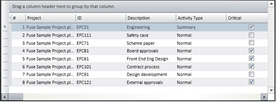
| Field | Description |
|---|
| Tabular Mode
|
Click this command to view the activities in tabular format.
|
| Heat Map
|
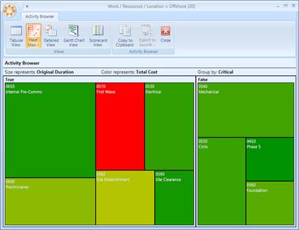
Click this command to view the activities in heat map format.
The heat map mode is an extremely powerful visual aid with regards to reporting results. A heat map chart uses relative box size and color to distinguish various attributes of activities. Any activity attribute can be used to define box size, color, and grouping of heat maps charts.
In addition, the number of activities shown in a heat map chart can be defined.
The heat map example below illustrates:
- Size of box showing duration.
- Color showing Total Cost.
- Grouped by showing Critical/Non Critical.
|
| Detailed
|
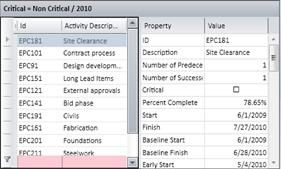
Click this command to view the list of activities with detailed information.
|
| Gantt
|
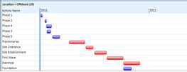
Click this command to view the activities in a Gantt chart format.
|
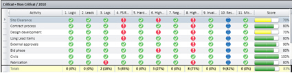
| Scorecard
|
Click this command to view the activities in a scorecard format. This view gives the advantage of totaling metric scores directly within the analysis view.
|
| To Excel
|
Click this command to export the Activity Browser to an Excel worksheet in a Microsoft Excel file. Use the commands in the drop-down menu to specify whether you want to export to an Excel file (XLS) or an Excel XML file.
|
| Undock
|
Click this command to create a floating window for easier viewing and window sizing.
|